환경 : Colab
from google.colab import drive
drive.mount('/content/drive')

!sudo apt-get install -y fonts-nanum
!sudo fc-cache -fv
!rm ~/.cache/matplotlib -rf
구글 드라이브를 통해 파일을 업로드 할 것이다.
그리고 코랩에서의 그래프에서 한글이 깨지는 것을 방지하기 위해 위 폰트들을 설치한 후 런타임 재실행한다.
import pandas as pd
import matplotlib.pyplot as plt
import numpy as np
import seaborn as sns
import warnings
warnings.filterwarnings(action='ignore')

palette = sns.color_palette('Dark2')
plt.rc('font', family='NanumBarunGothic')

train = pd.read_csv('train 경로')
test = pd.read_csv('test 경로')
submission = pd.read_csv('submission 경로')

print(train.shape, train.columns)
print(test.shape, test.columns)
print(submission.shape, submission.columns)- 필요한 라이브러리를 불러오고
- 경고 메시지 제거, 그래프 색상 지정, 폰트 지정을 했다.
- 그리고 구글 드라이브에 있는 파일을 read_csv로 읽어왔다.
- 각 데이터 프레임의 모양과 컬럼명을 확인했다.
train.info()
#<class 'pandas.core.frame.DataFrame'>
#RangeIndex: 1459 entries, 0 to 1458
#Data columns (total 11 columns):
# #   Column                  Non-Null Count  Dtype
#---  ------                  --------------  -----
# 0   id                      1459 non-null   int64
# 1   hour                    1459 non-null   int64
# 2   hour_bef_temperature    1457 non-null   float64
# 3   hour_bef_precipitation  1457 non-null   float64
# 4   hour_bef_windspeed      1450 non-null   float64
# 5   hour_bef_humidity       1457 non-null   float64
# 6   hour_bef_visibility     1457 non-null   float64
# 7   hour_bef_ozone          1383 non-null   float64
# 8   hour_bef_pm10           1369 non-null   float64
# 9   hour_bef_pm2.5          1342 non-null   float64
# 10  count                   1459 non-null   float64
#dtypes: float64(9), int64(2)
#memory usage: 125.5 KB
#[4]
#0초
일단 훈련 데이터의 정보를 봤을 때 몇몇 컬럼에서 결측값이 있는 것을 확인했다.
각 컬럼별 결측값이 직관적으로 다가오지 않아 시각화를 했다.
plt.title("결측값 확인 그래프")
train.isnull().sum().plot.barh(color=palette)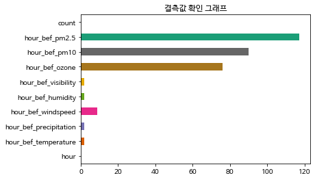
위 그래프를 봤을 때 미세먼지, 오존 데이터에 결측값이 많다는 것을 확인했다.
각 결측값을 채우기 위해 어떻게 해야 할지 조사했다.
sns.heatmap(train.corr(), annot=True, fmt = '.2f', linewidths=.5)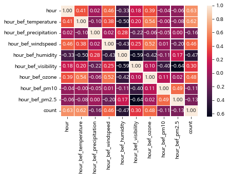
위 그래프를 보면 id 값이 없는걸 확인할 수 있는데 id 는 각 row을 식별하는 고유의 값이기 때문에 분석에 도움되지 않아 drop했다.
train.drop('id', inplace=True, axis=1)다시 상관계수 그래프를 보면 상관관계가 있는 값들이 보인다.
hour, temperature는 count와 상대적으로 강한 양의 상관관계를 가지고 있다.
그리고 시간 / 온도, 풍속, 오존은 약한 양의 상관관계를 , 습도는 음의 상관관계를 가지고 있다.
따라서 시간에 따라 온도, 풍속, 오존, 습도의 결측값을 대체하기로 했다.
hour_null_col = ['hour_bef_temperature', 'hour_bef_windspeed', 'hour_bef_humidity', 'hour_bef_ozone']
for col in hour_null_col:
    index = train[train[col].isnull()][col].index
    print(col)
    for i in index:
        hour = train.iloc[i, :]['hour']

        train[col][i] = groupby_hour.iloc[int(hour), :][col]
그리고 나머지 결측값들은 각 컬럼의 평균값으로 대체하기로 했다.
train['hour_bef_precipitation'].fillna(train['hour_bef_precipitation'].mean(), inplace=True)
train['hour_bef_visibility'].fillna(train['hour_bef_visibility'].mean(), inplace=True)
train['hour_bef_ozone'].fillna(train['hour_bef_ozone'].mean(), inplace=True)
train['hour_bef_pm10'].fillna(train['hour_bef_pm10'].mean(), inplace=True)
train['hour_bef_pm2.5'].fillna(train['hour_bef_pm2.5'].mean(), inplace=True)
시각화
train['AMPM'] = np.where(train['hour'] >= 12, "PM", "AM")

plt.title("오전 / 오후 사용량 비교")
train.groupby("AMPM").sum()['count'].plot.pie(colors = palette, autopct='%.1f%%')
오전보다 오후에 3배가량 사용량이 많다.
figure, axs = plt.subplots(figsize=(15, 15), nrows=3, ncols=4)
axs = axs.flatten()
for i in range(1, len(train.columns)):
    sns.boxplot(train['hour'], train.iloc[:, i], ax=axs[i])
데이터가 전체적으로 연속 변수이기 때문에 boxplot으로 이상값과 데이터의 분포를 확인했다.
이상값이 매우 많다는 것을 알 수 있었다.
gubun = []
for pm in train['hour_bef_pm2.5']:
    if pm <= 15:
        gubun.append("좋음")
    elif pm <= 50:
        gubun.append("보통")
    elif pm <= 100:
        gubun.append("나쁨")
    else:
        gubun.append("매우나쁨")

train["초미세먼지"] = pd.Series(gubun)
train.head()
gubun = []
for pm in train['hour_bef_pm10']:
if pm <= 30:
gubun.append("좋음")
elif pm <= 80:
gubun.append("보통")
elif pm <= 150:
gubun.append("나쁨")
else:
gubun.append("매우나쁨")
train["미세먼지"] = pd.Series(gubun)
train.head()미세먼지, 초미세먼지 나눈 기준 : https://misebig.tistory.com/6
미세빅이 PM2.5, PM10, NO2의 4단계를 6단계로 개편한 이야기
US AQI와 WHO Air Quality Guidelines을 참고하여 초미세먼지, 미세먼지, 이산화질소의 4단계를 6단계로 개선 이번 겨울 초미세먼지 농도가 100~200 μg/m3나 되던 적이 있었죠, 농도가 51 μg/m3 이든 200 μg/m3 이
misebig.tistory.com
plt.figure(figsize=(9, 6))
plt.subplot(1, 2, 1)
plt.title("초미세먼지")
train.groupby("초미세먼지").sum()['count'].plot.bar(color=palette)
plt.subplot(1, 2, 2)
plt.title("미세먼지")
train.groupby("미세먼지").sum()['count'].plot.bar(color=palette)
미세먼지, 초미세먼지가 보통일 때 이용량이 가장 많았고 좋음, 나쁨 순이다.
미세먼지, 초미세먼지가 좋음이라고 해서 사용량이 늘어나진 않는 것 같다.
train['hour_bef_precipitation'] = train['hour_bef_precipitation'].map(lambda x : round(x))비가 내렸는지 내리지 않았는지에 따라 분석하기 전 강수 유무 값에 이상값이 있어 0, 1로만 만들어줬다.
plt.title("비 내림 유무에 따른 사용량")
train.groupby("hour_bef_precipitation").sum()['count'].plot.bar(color=palette)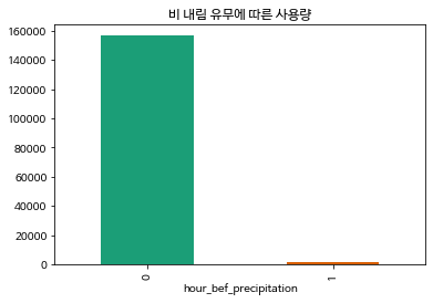
비가 내릴 땐 사용량이 급격히 준다.
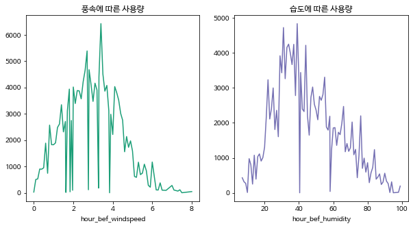
plt.figure(figsize=(10, 5))
plt.subplot(1, 2, 1)
plt.title("풍속에 따른 사용량")
train.groupby('hour_bef_windspeed').sum()['count'].plot(color=palette[0])
plt.subplot(1, 2, 2)
plt.title("습도에 따른 사용량")
train.groupby("hour_bef_humidity").sum()['count'].plot(color=palette[2])
그렇다면 풍속과 습도에 따른 사용량은 어떨까
마지막으로 시간에 따른 사용량이다.
plt.title("시간에 따른 사용량")
train.groupby('hour').sum()['count'].plot.bar(color=palette)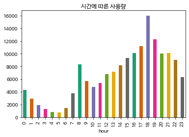
위 그래프를 보면 오전엔 8시, 오후엔 6시가 각 피크이다.
왜 그럴까 생각을 해보면 오전엔 출근?을 할 때 사용하는 것 같고 오후엔 퇴근 및 산책에 이용되는게 아닐까 싶다.
다음은 지금까지 분석한 내용을 바탕으로 사용량을 예측해보겠다.
'AI > 데이터 분석' 카테고리의 다른 글
| Bag of Words (BoW)란 ? (0) | 2024.02.24 |
|---|---|
| 왁물원 카페 크롤링 및 우왁굳즈 워드클라우드 (0) | 2022.12.21 |